
UI/UX · 2026
Analytics dashboard UI/UX concept
A data-dense dashboard concept with a clear visual hierarchy.
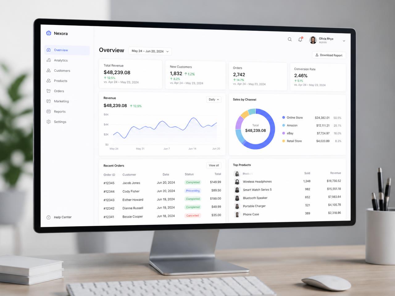
Overview
Analytics dashboard UI/UX concept is an in-house concept sample from the Gynex Tech studio, created to show the standard of ui/ux work we deliver for clients in India, the UK, the USA, Canada, Australia and the UAE.
The problem
Businesses in this category usually arrive with inconsistent visuals, unclear messaging and no reusable system — so every new campaign starts from zero.
Our solution
We built a dashboard information architecture that surfaces decisions, not just charts — a considered layout, a disciplined type scale, an accessible colour system and reusable components that scale to new campaigns without redesign.
The result
The result is a consistent, conversion-focused asset set. Verified client results are shared privately on request — we never publish invented performance numbers.
Client
Concept Sample
Technology used
- UI design
- UX research
- Design systems
- Data visualisation
Deliverables
- · Wireframes
- · UI screens
- · Component library
Gallery
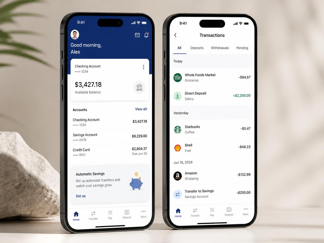
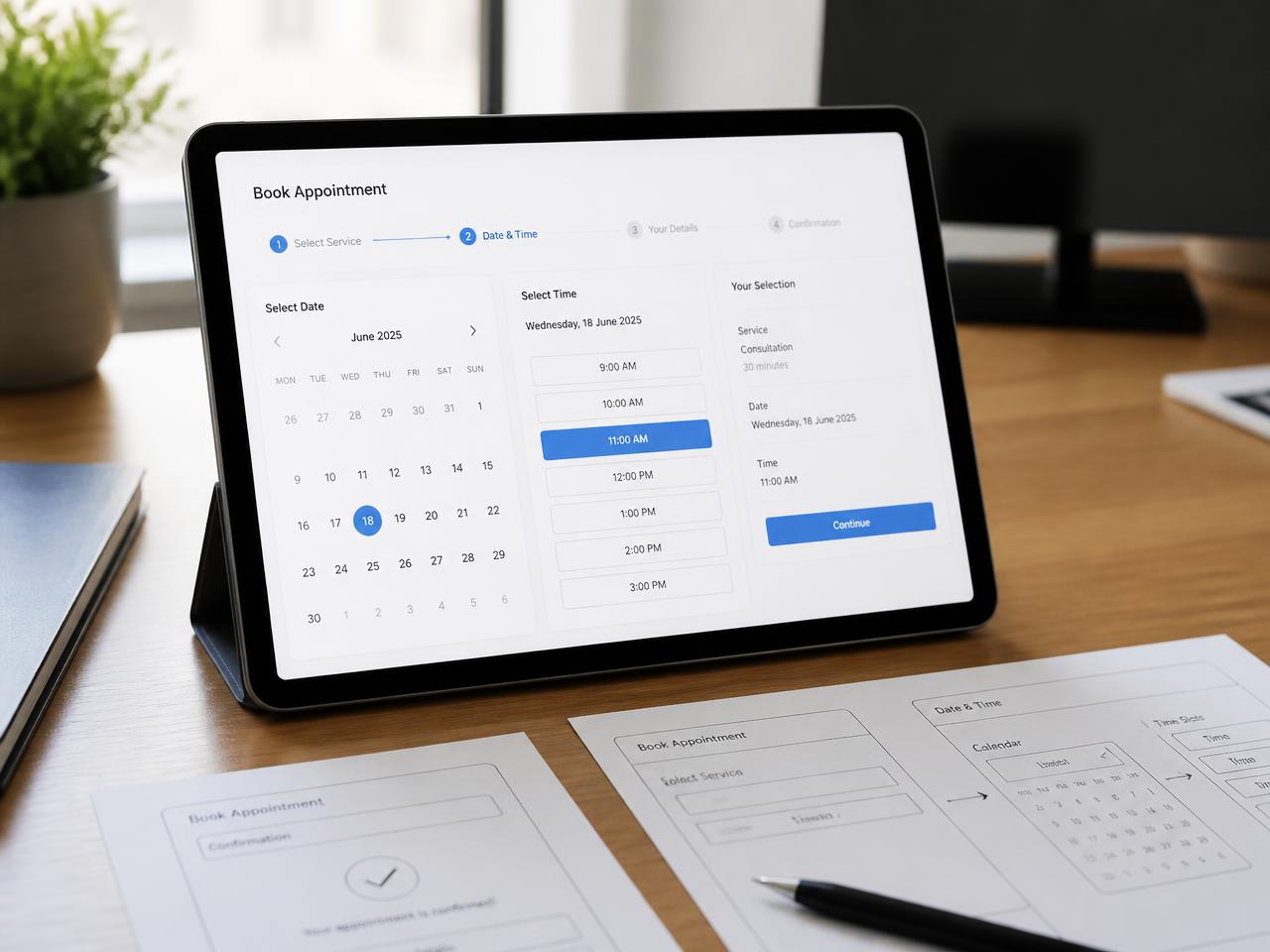
Selected views from the project
Have a similar challenge?
Tell us what you're trying to achieve. We'll come back within one working day with a clear point of view — and no pressure to commit.
hello.gynextechnology@gmail.com